From digital output to brand operating system.
A guidebook for making New Digital Noise feel international, forward-looking, simple, evidence-led and ready for enterprise clients.
Strategic
Consulting-grade framing before design decoration.
Current
AI, GEO, data and social signals expressed with clarity.
Scalable
One system across website, social, decks, proposals and BD.
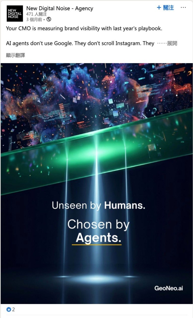
Make brands more visible, more intelligent and more actionable.
NDN should not sound like a production vendor. It should sound like a partner that connects brand, content, technology, performance and conversion into one measurable system.
Clarity: define the business problem before showing creative output.
Intelligence: connect AI, data and audience behaviour to decision making.
Momentum: turn campaigns into learning systems that improve over time.
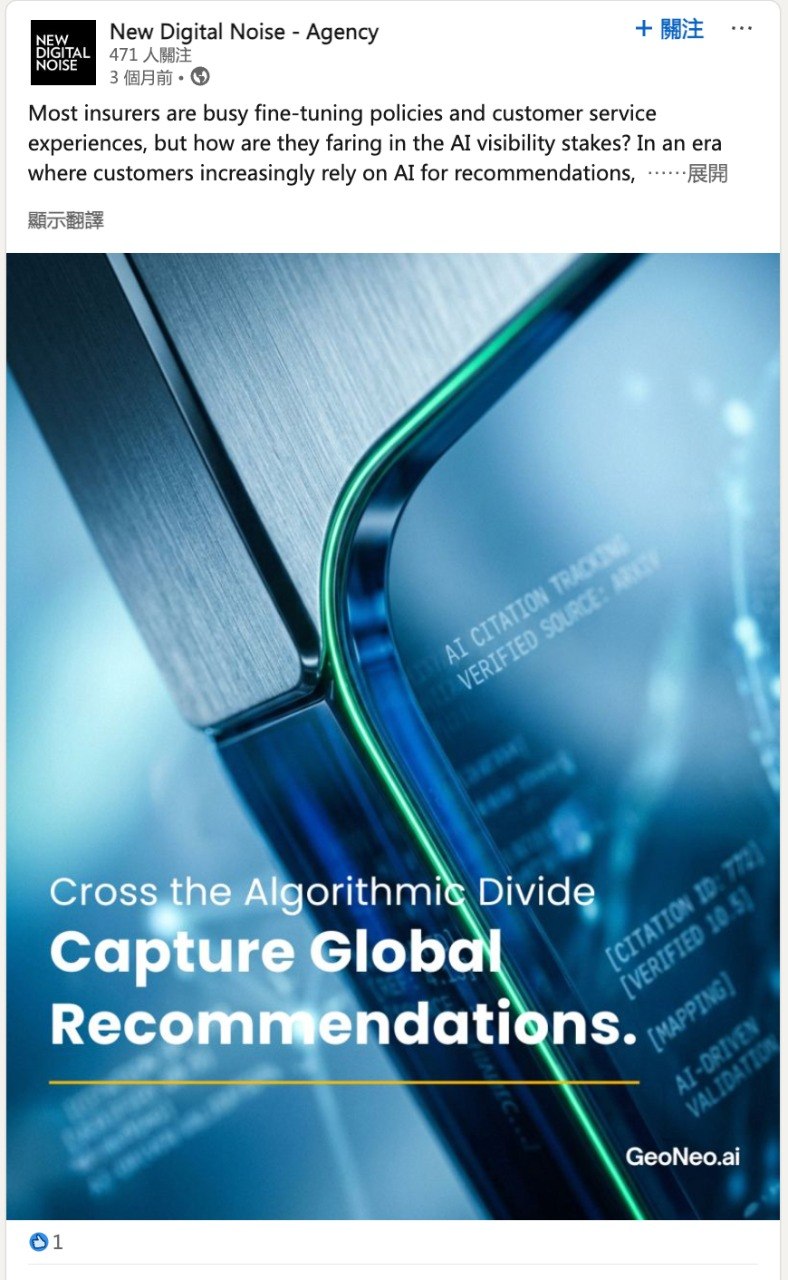
Authority should be shown as evidence, not claimed as decoration.
Use NDN credentials as a proof layer throughout communications. The tone should feel measured, factual and enterprise-ready.
Founded
Two decades of digital transformation experience.
Projects
Scale and implementation depth across digital touchpoints.
Industries
Sector knowledge across complex organisations.
Offices
Hong Kong, Shanghai, Macau, Singapore and Vietnam footprint.
Clients
Experience with multinationals, local leaders and growth companies.
Now
AI, GEO, content and data integrated into modern marketing systems.
NDN should be organised as a strategic capability system.
Like a large agency or consultancy, the brand needs clear service pillars that make the offer easier to understand, sell and scale.
Positioning, editorial systems, campaign narratives, thought leadership and content-to-conversion planning.
AI search visibility, entity clarity, credible content signals, answer engine readiness and diagnostic audits.
UX, web platforms, CRM, data capture, conversion journeys and digital product delivery.
Performance learning loops, dashboards, media optimisation, lead quality and business response tracking.
Speak like a strategic advisor, not a hype machine.
The NDN written style should borrow the credibility rhythm of global consultancies: evidence first, implications second, recommendations third.
A sentence structure NDN can own across AI search, GEO and performance conversations.
The logo must always be visible, quiet and confident.
Use the black logo on light backgrounds and the white logo on black or dark image backgrounds. Never place the logo on busy image areas where the wordmark loses impact.

Clear Space
Keep at least the height of “NEW” around the logo. More space is preferred for premium layouts.
Minimum Size
Digital wordmark should not appear below 110px wide. For social avatars, use a dedicated mark crop.
Placement
Top-left for editorial layouts, bottom-left for image-led covers, centred only for formal brand pages.
Protect the wordmark before adding visual energy.
Because the NDN logo is typographic and compact, contrast matters more than decoration. The system should make the logo unmistakable in social feeds, decks and website headers.
Use white logo on black, deep purple or dark photography with a clean corner.
Use black logo on white, pale blue, light grey or clean image areas.
Add a solid logo block on busy visuals instead of letting the mark disappear.
Do not stretch, outline, recolour, add glow, rotate or place the logo over complex detail.
Black and white create authority. Purple and electric accents create momentum.
The palette should not become a purple-only look. Use black, white and neutral surfaces as the base. Purple is the NDN energy cue. Electric teal, blue and orange are secondary system signals.
#050505
#FFFFFF
#7A00FF
#1018F5
#00E6D0
Primary Ratio
60% black / white / neutral, 30% deep violet, 10% electric accents.
Usage Rule
Use bright colour to structure meaning: highlight one word, one chart, one navigation cue or one CTA.
Typography should feel editorial, digital and precise.
Use strong sans-serif hierarchy with generous spacing. Headlines should be short. Body copy should be direct, evidence-led and easy to scan.
Headline
Inter ExtraBold / Syne Bold
Highlight
Bold colour or reverse text
Body
Plain, confident, short paragraphs
Brands need systems that make decisions easier: what to say, how to show it, where to measure it and how to improve it.
Use images that prove capability, not generic technology mood.
NDN visuals should show intelligence in motion: humans, interface signals, spatial light, data surfaces, AI objects and campaign evidence. Avoid stock-like robots, random neon tunnels and overused tech clichés.
Human + technology interaction, with one clear idea per frame.
High contrast light, controlled purple accents and clean negative space.
Use NDN work, NDN posts, NDN campaign assets and NDN credential pages as the preferred image pool.
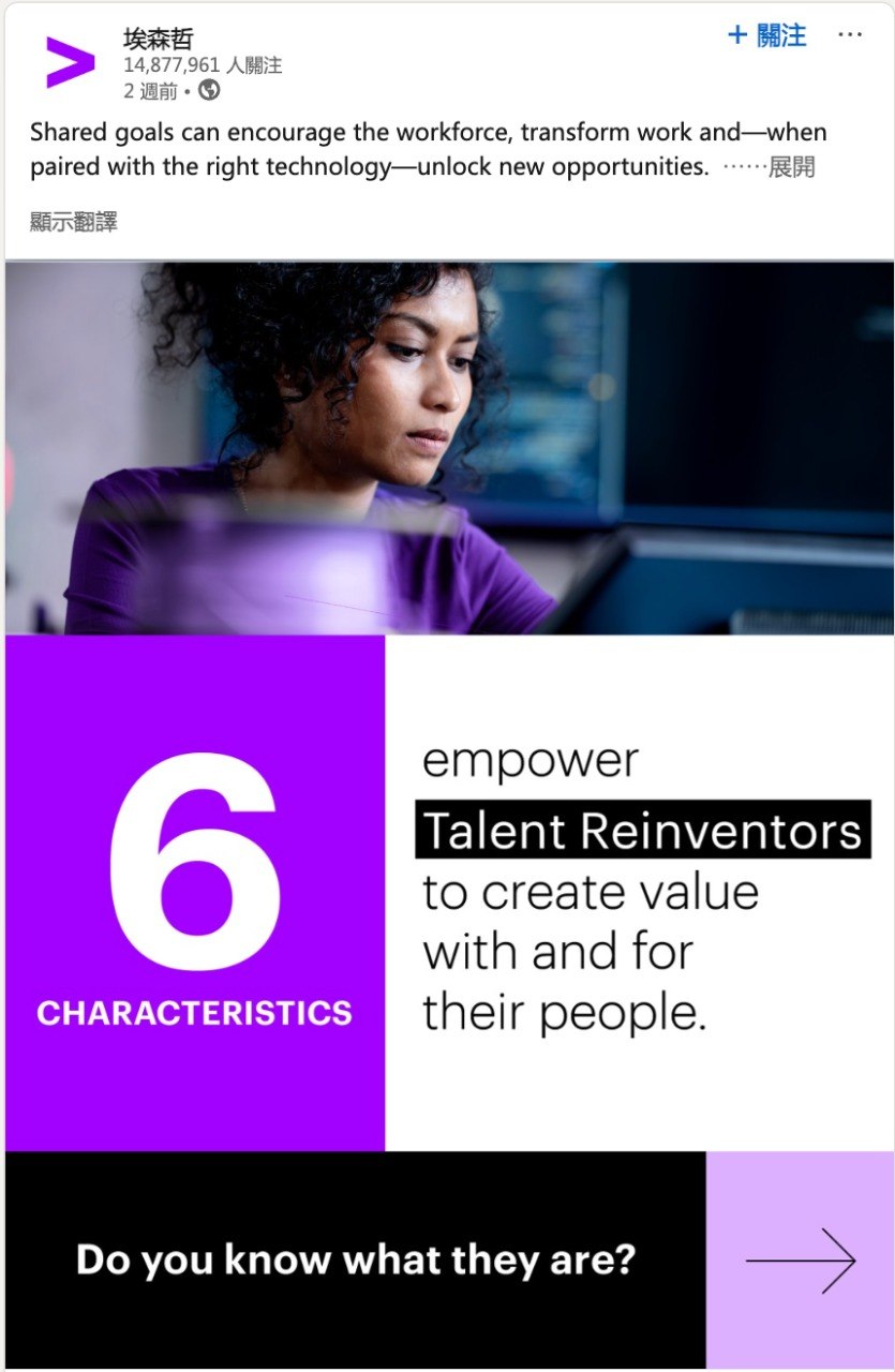


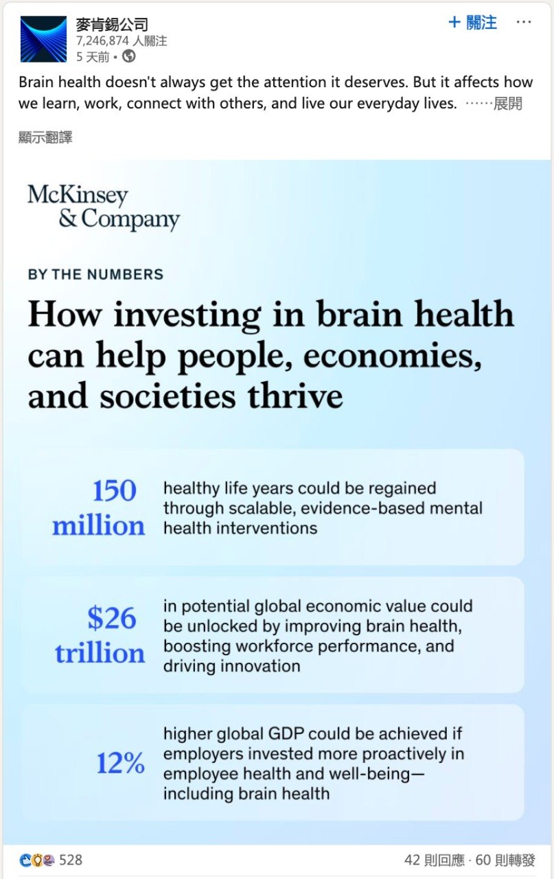
One idea. One image. One directional cue.
The Accenture-style reference works because it is simple: large number, strong headline, one image, one motion cue. NDN can adopt the structure without copying the brand.
Split Field
50/50 or 60/40 text-image composition. Use white space as part of the identity.
Number System
Use numbered principles for clarity: 1. Clarity, 2. Intelligence, 3. Momentum.
Highlight Bar
Reverse important phrases in black or violet blocks for immediate scanning.
Arrow Cue
Use a simple arrow to imply progression, not decoration.
Clarity
Aligning brand, content and technology around a shared definition of value and success.
Make intelligence visible through simple systems.
The reference direction from McKinsey and Accenture is useful because data is treated as a visual argument. NDN should use numbers, maps, data surfaces and motion cues to make expertise feel tangible.
Big Number
Use one hero statistic per frame. Explain the implication in plain language.
System Object
Use cubes, layers, screens, grids and light paths to signal AI/data systems.
Human Signal
Balance abstract technology with people, teams, customers or decision makers.
Motion Cue
Use arrows, beams and progress lines only when they show direction or flow.
Strategic social visual template
Beyond clicks.
Measure AI visibility.
Template Rule
Use this rhythm for thought leadership: issue headline, evidence visual, one highlighted phrase, clear logo placement and a CTA that feels consultative.
The brand system should help BD open better conversations.
Use the guidebook as the standard for NDN web pages, pitch decks, LinkedIn thought leadership and client follow-up material.
Each service page should lead with a business issue, then show method, evidence, service modules and CTA.
Use talking points as a meeting opener: what changed, why it matters, what the client should check, how NDN can help.
Proposal decks should use the same logic: diagnostic frame, proof, solution architecture, roadmap, measurement.
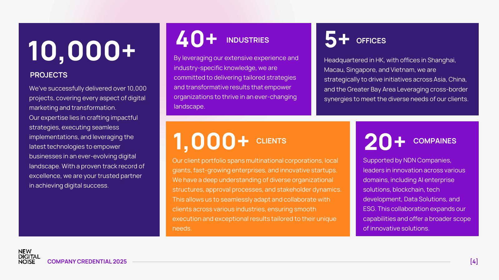
Turn credentials into proof categories BD can reuse.
The company credential should not sit as a separate deck only. It should become a reusable evidence library for website pages, LinkedIn thought leadership, pitch decks and follow-up material.
Use BUPA, Ocean Park x Maxim's, Tao Ti and Hang Seng examples to prove applied AI, not abstract AI claims.
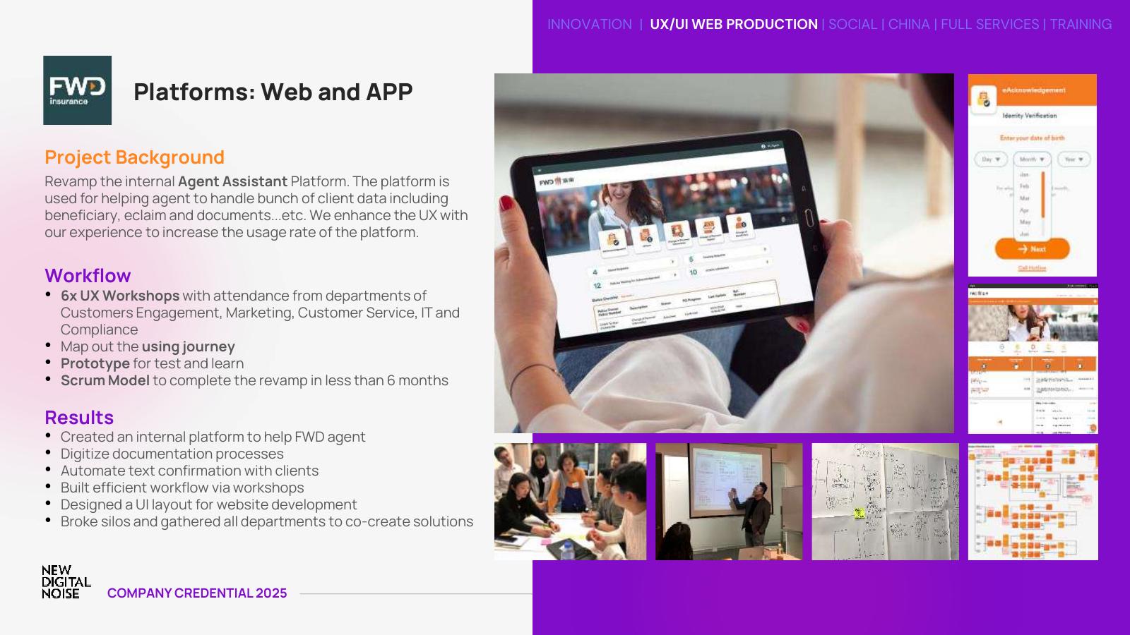
Use FWD, Cigna and HKJC to show research, workshops, information architecture, CMS and platform delivery.
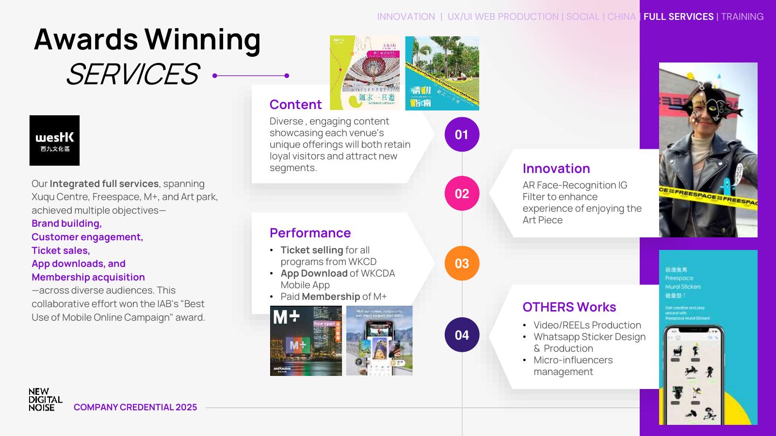
Use travel, retail, WKCD, AEON and China-market examples to connect content, media, conversion and business outcomes.
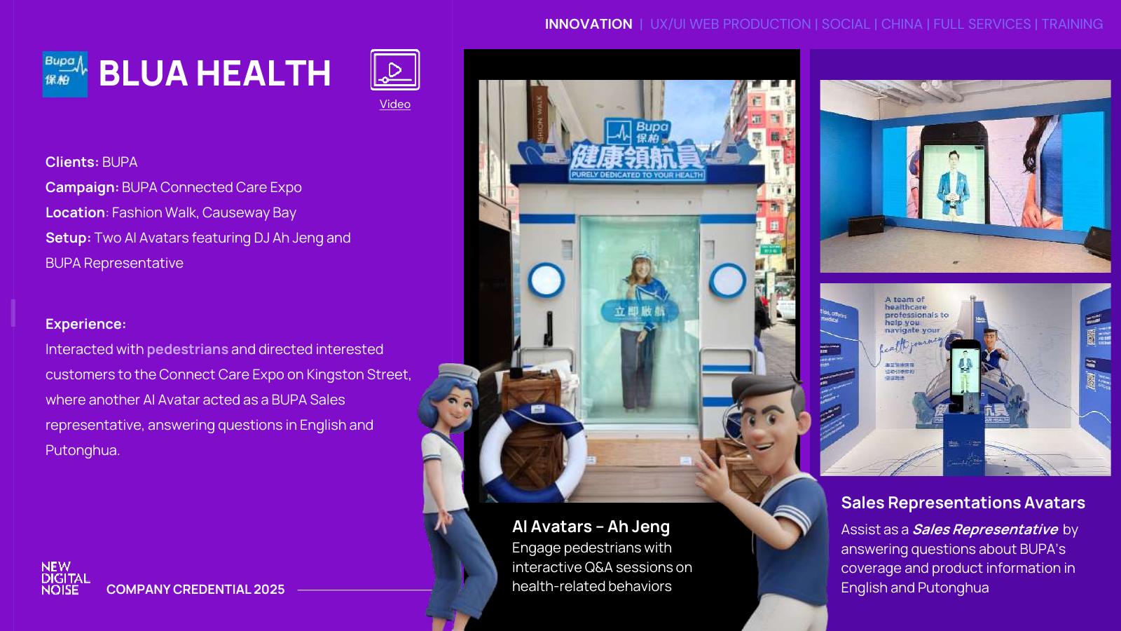
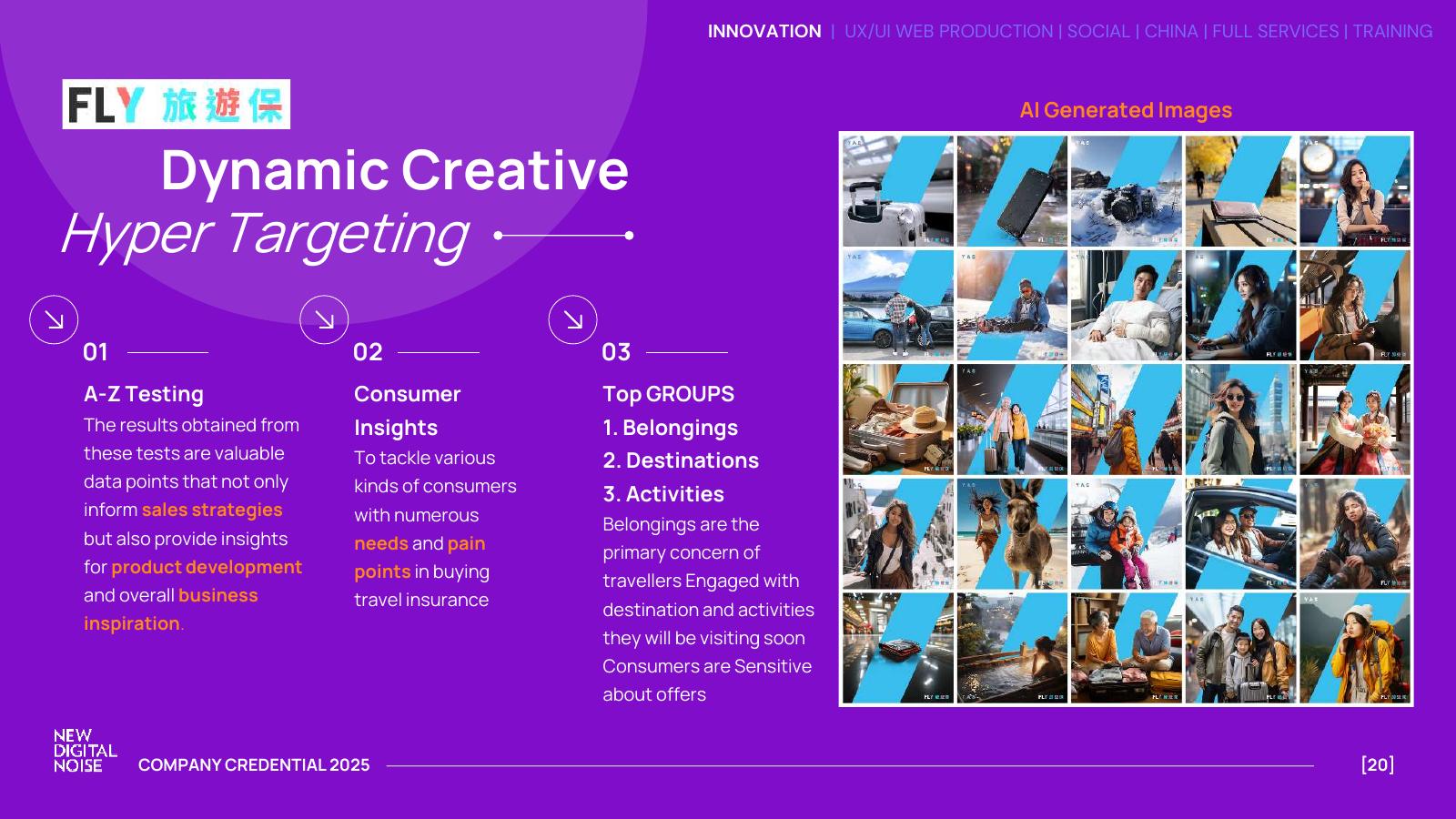
Consistency comes from a few rules used every time.
Before any NDN website page, LinkedIn post, carousel, proposal or BD follow-up is published, check the work against these standards.
Does it start with a business issue, not only a service description?
Is the NDN logo clearly visible against the background?
Is there one main idea per frame, section or slide?
Does the visual feel international, current and enterprise-ready?
Is there proof: credential, case, signal, metric, method or diagnostic question?
Is the next action clear: scan, meeting, enquiry, download, follow-up or proposal?
Measure the whole journey from visibility to business response.
Automation should start after the dashboard logic is clear. Use manual input for the first one to two weeks, then connect GA4, EDM, social and enquiry data gradually.
Data Stack
Google Sheet as master database, UTM structure, GA4, EDM reports, social platform exports, manual BD notes, then Looker Studio or a custom one-page view.
Most Important Human Input
Did the topic create a real conversation? Did BD use it? Did a prospect mention it? Did it become a qualified lead?
Every carousel should teach one strategic framework.
LinkedIn is the priority platform. The same structure can be adapted into BD leave-behind PDFs, website summary blocks, EDM visuals and internal pitch slides.
Frame 01
Set the business question. Example: “Is your brand visible in AI search?”
Frame 02
Define the shift. Example: from searchable to recommendable.
Frame 03
Show the risk: omitted, misdescribed or outranked by competitors.
Frame 04
Introduce a diagnostic model with 3 to 5 questions.
Frame 05
Connect to NDN capability: content, GEO, AI visibility and conversion.
Frame 06
Close with a measured CTA: request a readiness scan.